Responsive design for social good
PROJECT
Academic
Google UX Design Course
My role
UX research
UX design
User testing
UI design
Visual Identity
Timeline
Jan 2024
1 week
A tool to save time and stop foodwaste
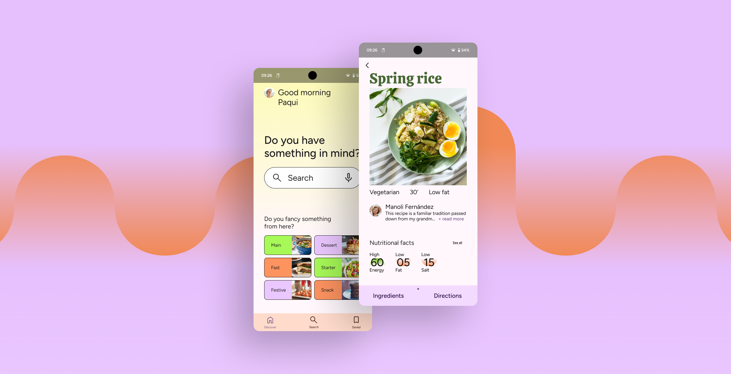
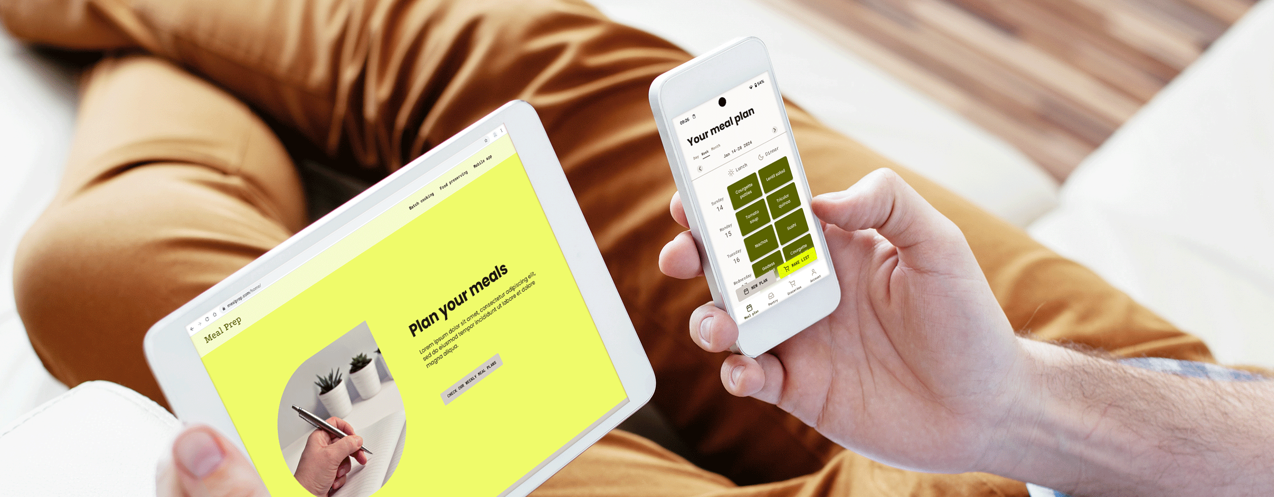
Meal Prep is a dedicated mobile app that allows users to plan their meals by designing monthly, weekly or daily menus and authomatically generating a grocery list for them. Additionally, the mission of Meal Prep extends to its responsive website where it displays ready made weekly plans for batch cooking and also raises awareness about food waste and different ways of food conservation explained in detail.
Why did Mealprep need to happen?
Lots of food waste are generated in each household because meals are forgotten at the fridge or not properly preserved. Additionally, individuals lack time to cook homemade meals or the energy to prepare nutritionally valuable menus, which can ultimately lead to health problems.
Whith this problem in mind, the goal was
to tackle food waste and to help people in improving their life quality.
Design Thinking
Design Thinking framework to guide the ideation and solution development process.

Understanding the user
Empathize

Ana María is a master’s student and homemaker who needs a way to remember the food she still has to consume because she forgets what’s left on the fridge and it ends up going to waste.
Pedro is a busy single dad who needs to speed up the process of deciding what to eat and cooking because he wants to spend more quality time with his daughter.
User journey
Goal: To plan the meals for the week and make a shopping list
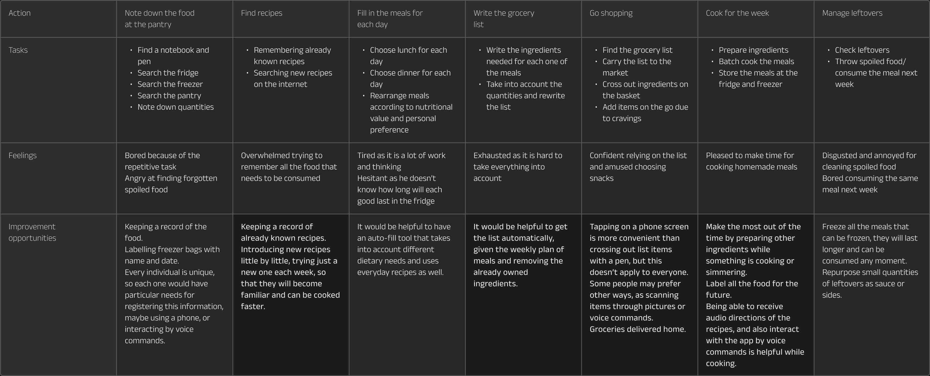
improvement opportunities
- Keeping a record of the food.
- Provide an automatic grocery list from a given meal plan.
- Improved accessibility with audio instructions and voice commands.
Competitive audit report
Define
During the competitive audit, it was found that the competitors dedicated applications offered the option to plan monthly, weekly and daily menus.
However, the interfaces were confusing and therefore not very user-friendly.
Opportunity:
Build a clear and usable interface.
Ideation
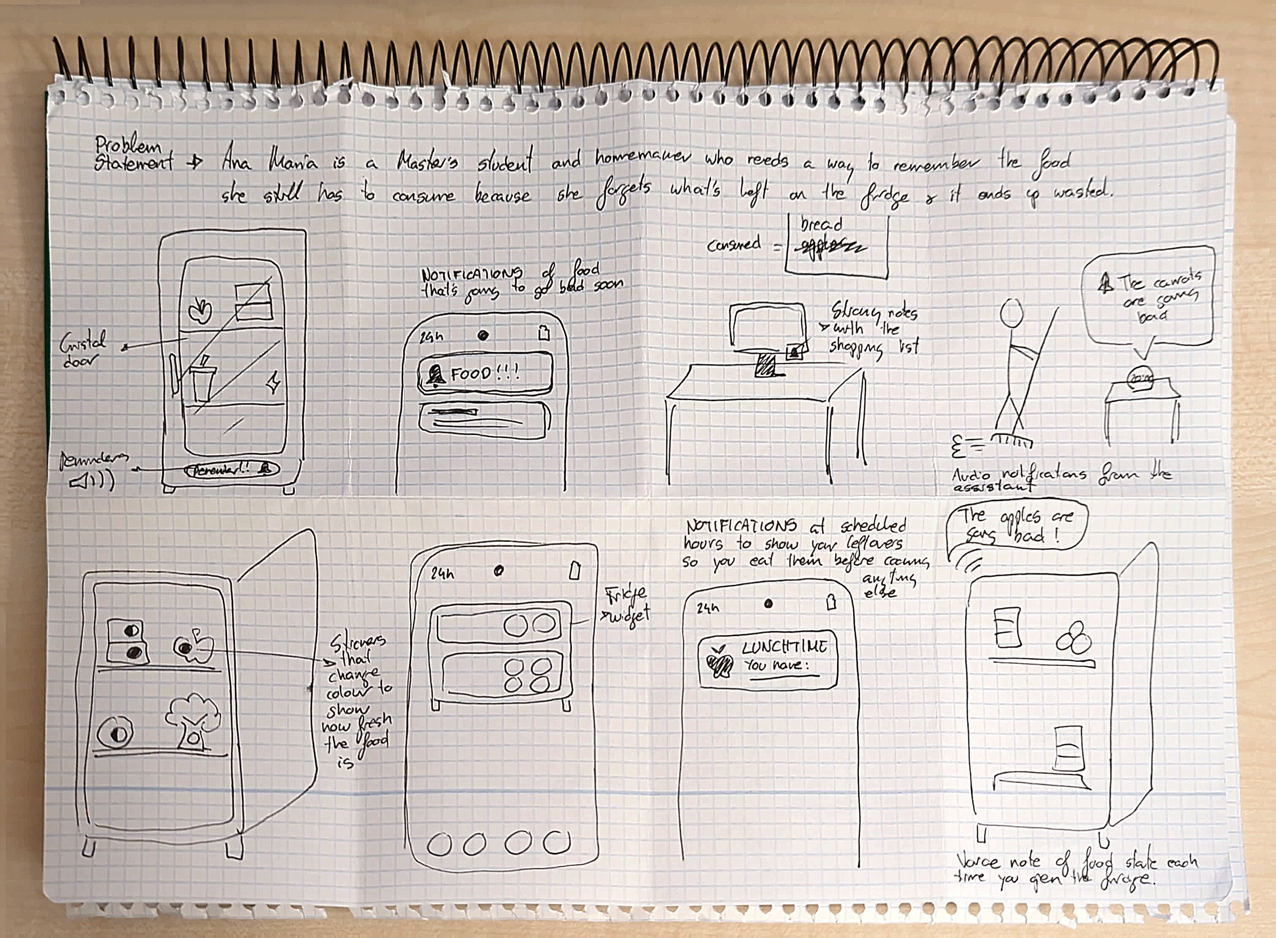
a. Scheduled notifications of available food.
It will help María know what she has, so she can prepare her meals accordingly.
b. Reminders of food state.
Useful so María can remember the food she has to consume before it goes bad.
c. Audio alerts when opening the fridge.
Whith this information, María can make decitions at the moment, reducing the cognitive load.
Starting the design
Prototype
Goal statement
The Meal Prep app will let users plan meals and keep a record of their food, which will affect Ana María by reducing her food waste.
User flow
Task I – Build a meal plan and make the grocery list

Task II – Cook a recipe from the meal plan

Task III – Fill pantry and remove a consumed item

Wireframes
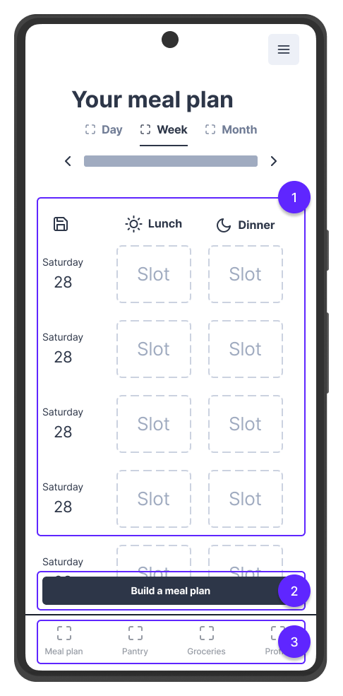
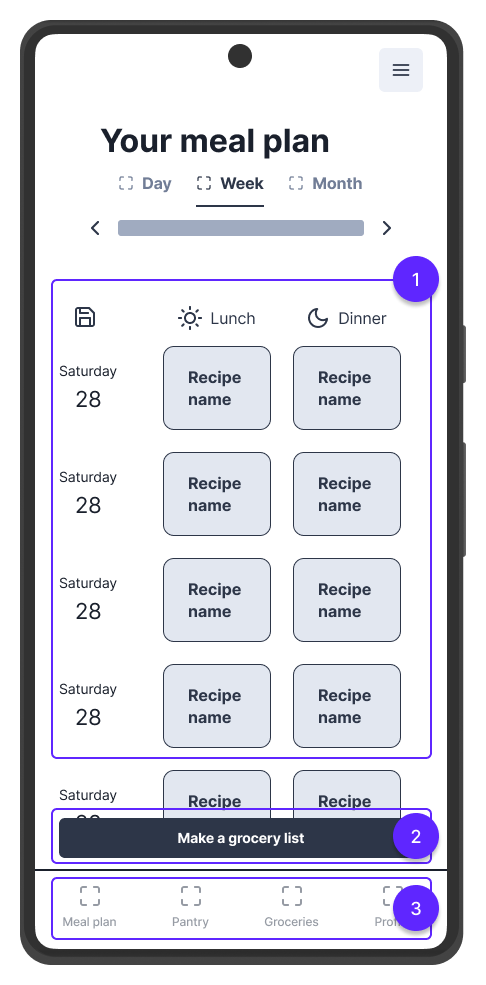
The goal of the page Meal plan is to make Meal Prep stand out among competitors while also enhacing the user experience.
- Clear and easy to understand UI.
- Guided action to get started easily.
- Straightforward navigation.
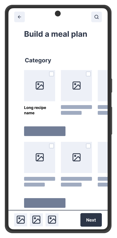
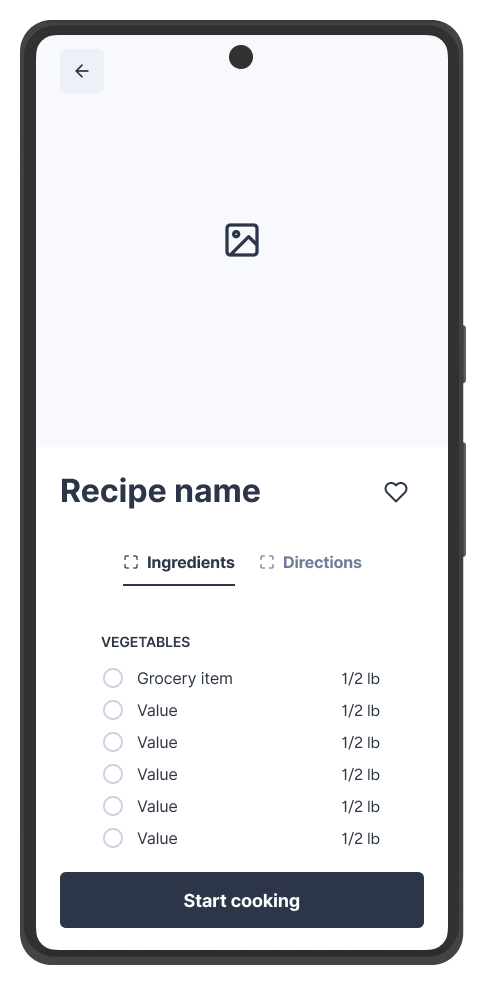
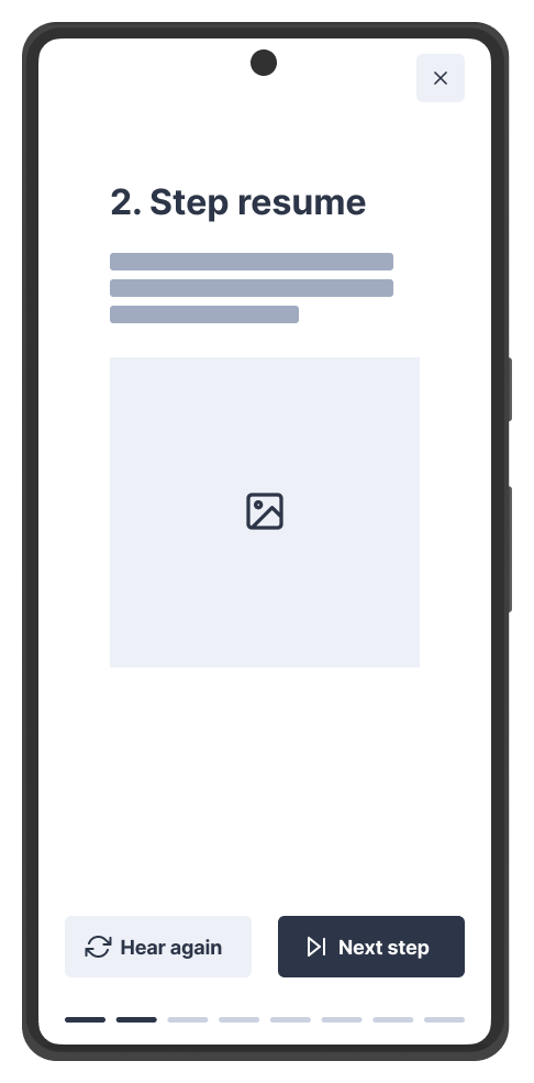
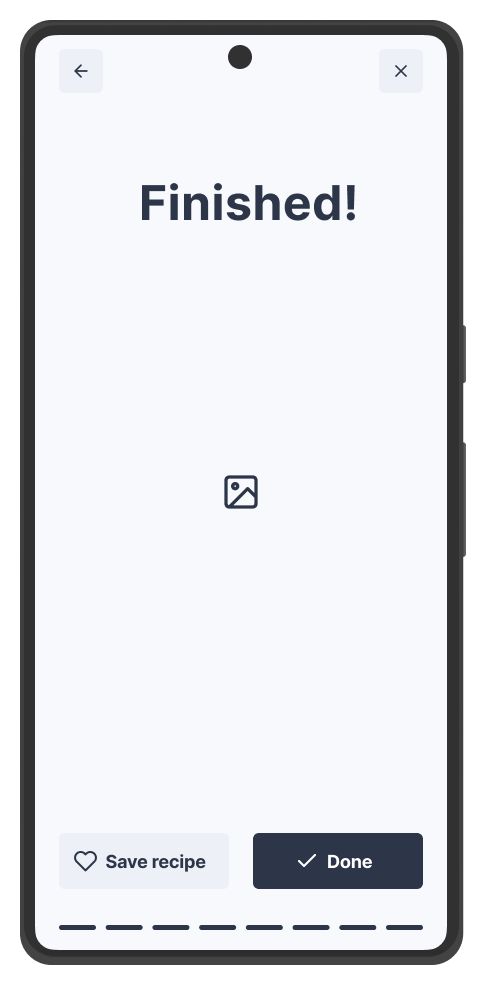
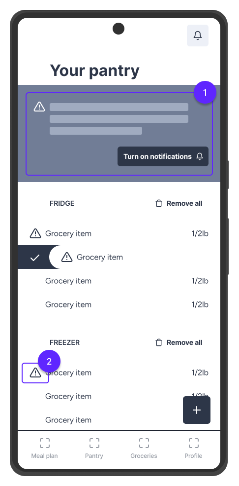
The pantry page was designed to help María remember the food she has, so that nothing goes to waste.
- Notifications when an item is going to go bad.
- Visual cues of food state.
Usability study
Test
Findings
- Users couldn’t find the button to generate a meal plan.
- Users easily completed most of the tasks, and expresed their interest on the application.
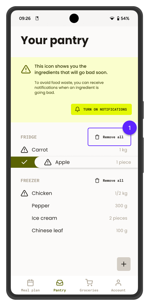
- Users wanted to quickly empty the pantry.
Parameters
Study type
Moderated usability study
Location
UK, presential
Participants
2 participants
Lenght
10-30 minutes
Refining the design
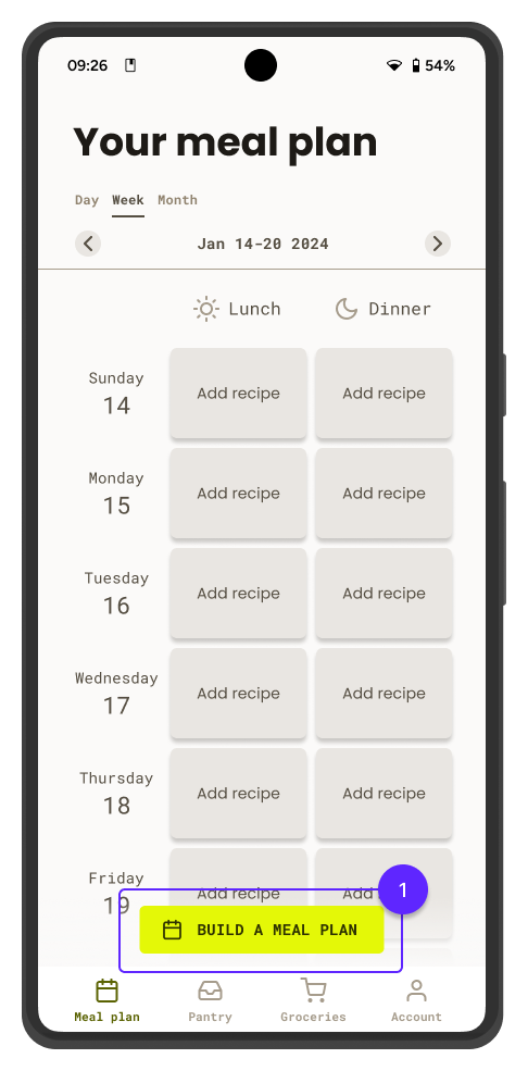
Some users had trouble at creating a new plan. This button invites them to explore the function while also guides new users.
- Call to action button.
Users sought after a way to remove multiple items at once to speed up the process of emptying the pantry, so the button remove all was included.
- Remove all button.


A product that evolves
Responsive design
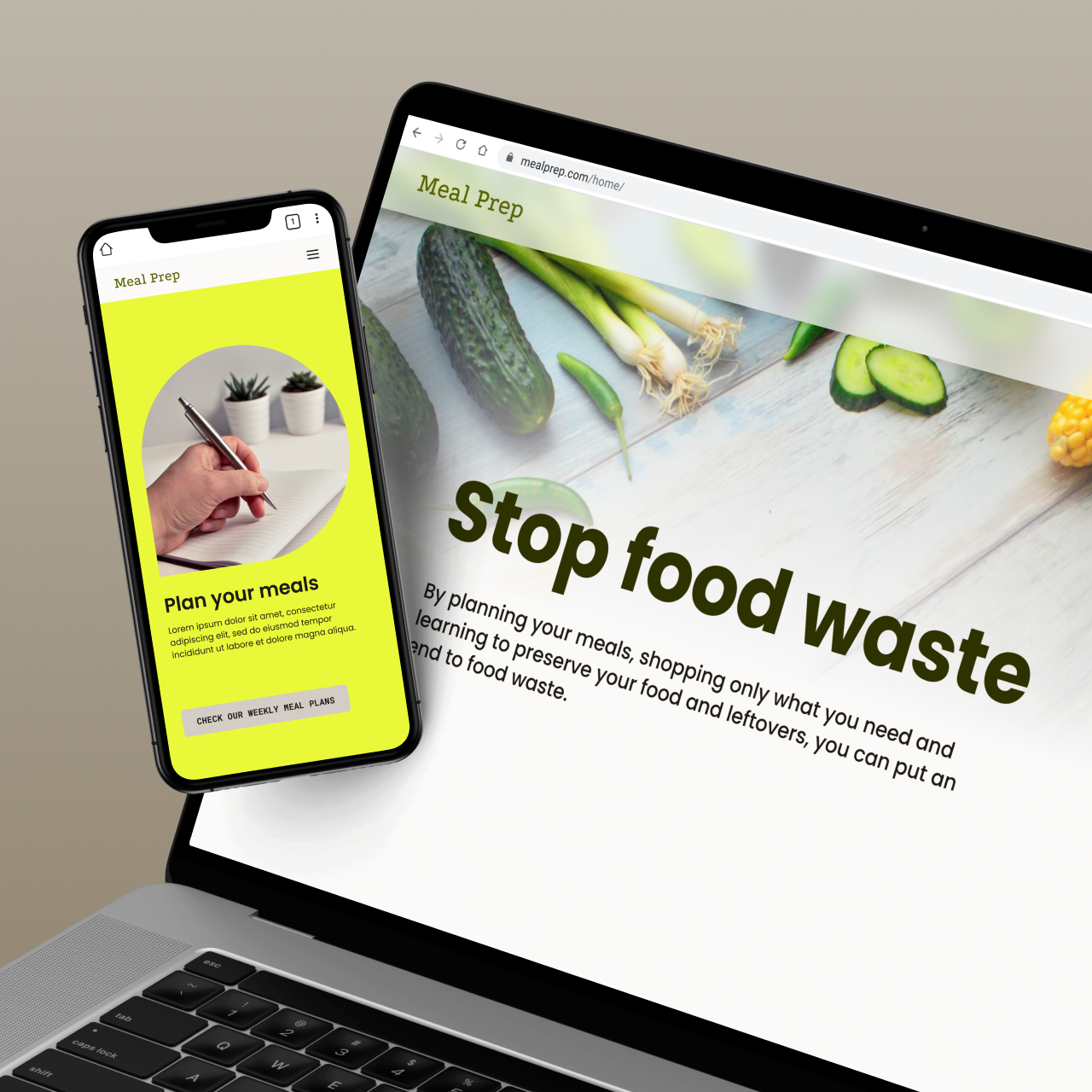
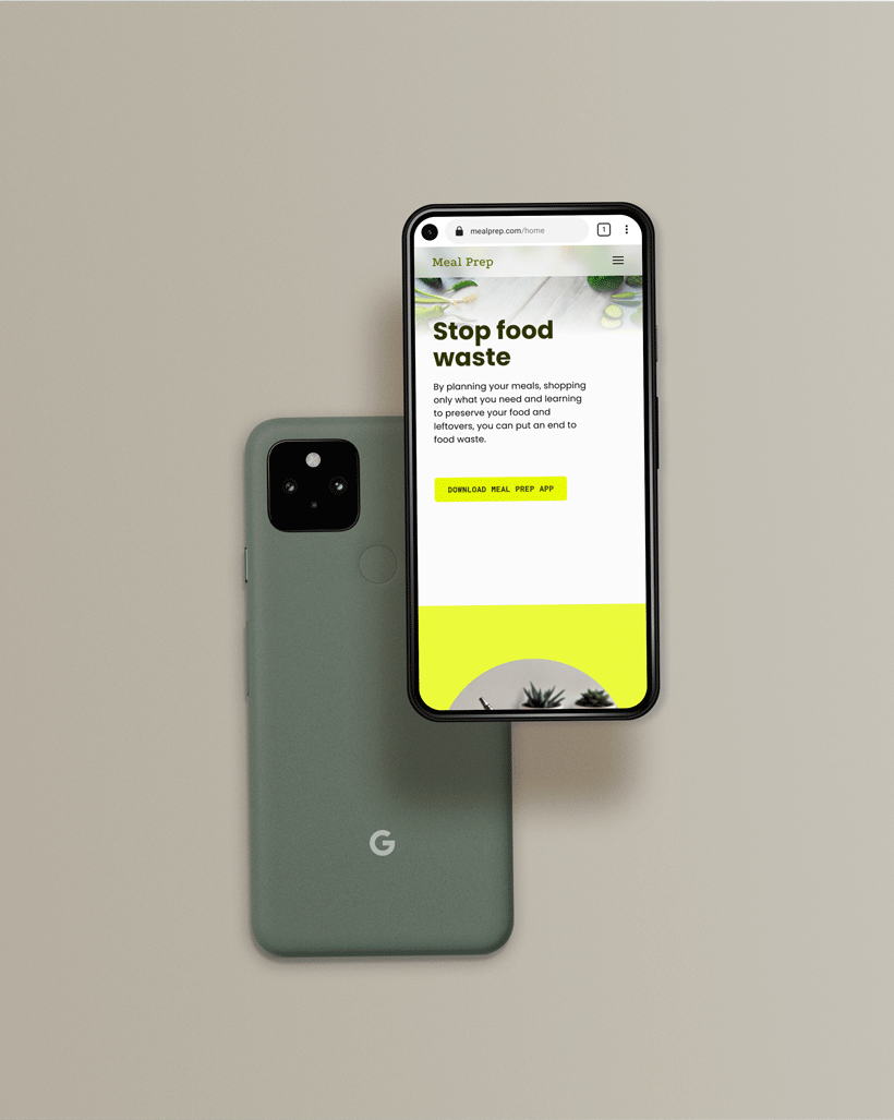
Besides the dedicated mobile application, Meal prep expands to a responsive website where the brand keeps working towards the mission of bringing healthy habits to people and tackling foodwaste at the same time.
Whilst the application is delivered as a handy tool for users to manage their meals to avoid food waste, easily follow recipes and automathize the grocery list,
the web version of Meal prep focuses on raising awareness about food waste and showing food preservation techniques.
On top of that, the web version also offers ready made weekly meal plans that are perfect for batch cooking and a page for promoting the app to new users.
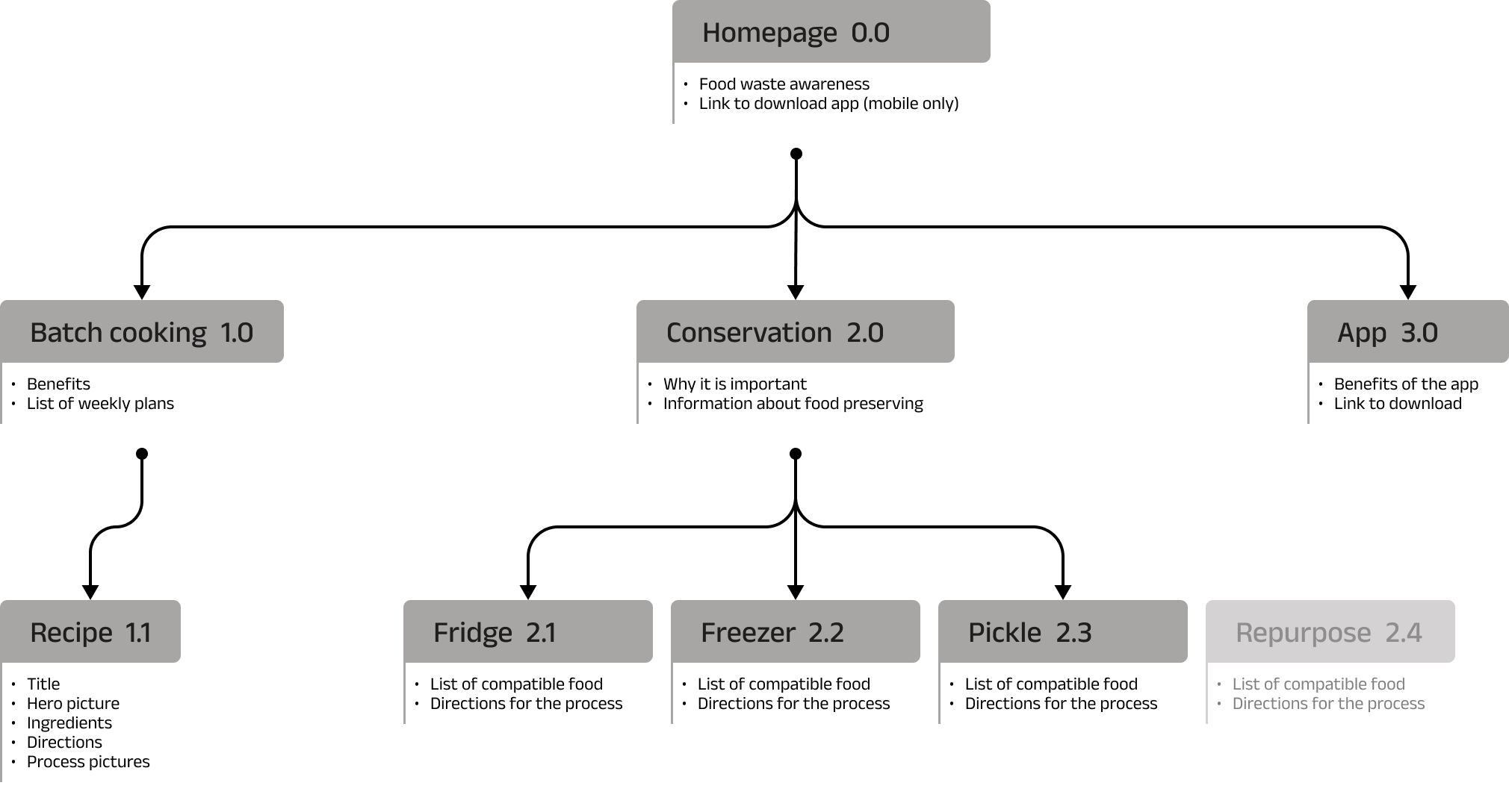
INFORMATION ARQUITECTURE
The web version content is structured following a hierarchical arquitecture.
This structure supports the future growth of the brand and the consequent new content that will be added, such as a forth method of food freservation.
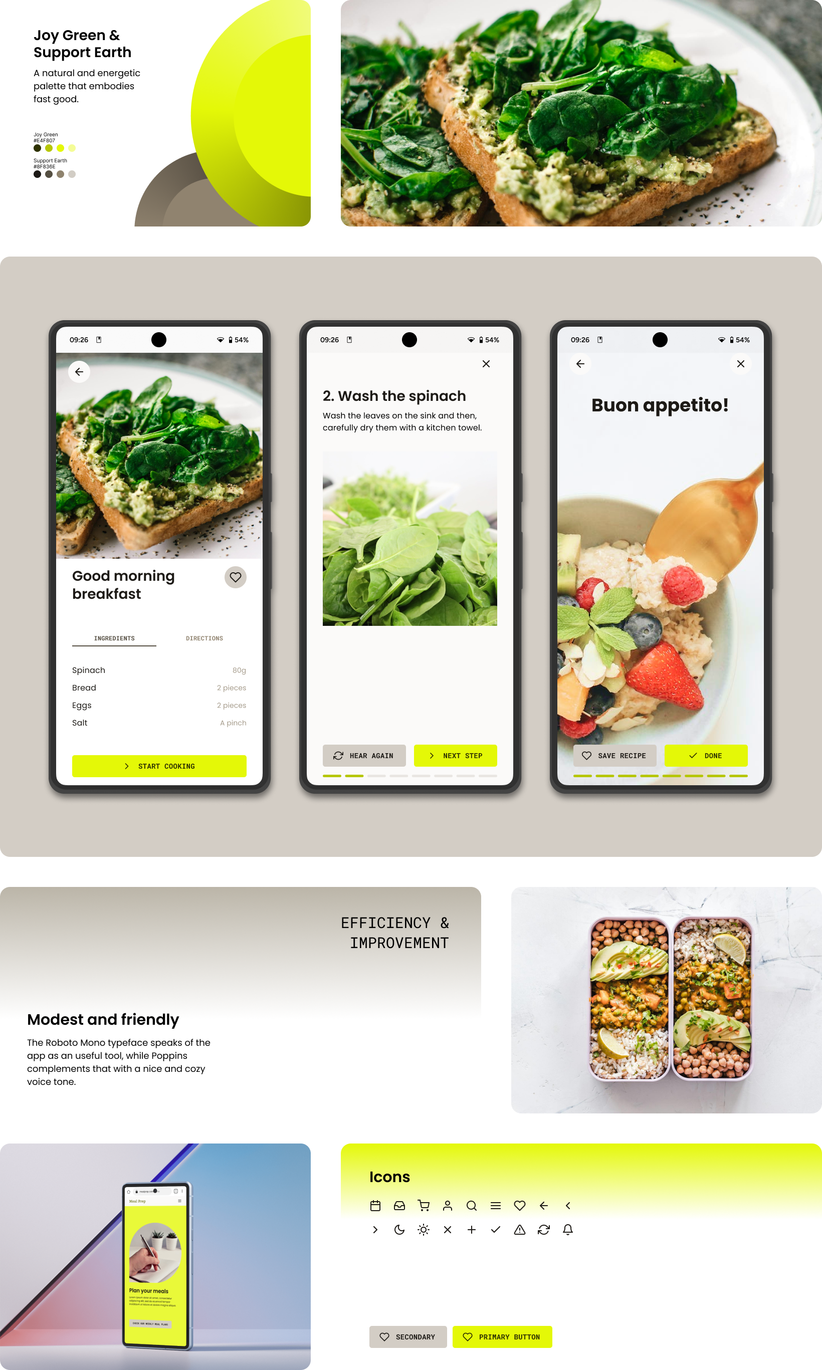
Neat & modest image
Branding
The visual identity of Meal prep speaks a language that is concise and easy to understand, which is exactly what busy users need. On top of that, it is clear that these end users are worried about their health and the climate change, because they choose to support local farmers and want to tackle food waste, hence the brand concept:
Fast Good
A design made for everyone
Accessibility

Icons near buttons make their purpose easier to understand.

AAA color contrast in text improves legibility.

Audio instructions while cooking, and voice activated controls to help all kinds of people cook more comfortably.
Going forward
Next steps
This project aimed to deliver a MPV which would allow users to complete the main flows in the dedicated app and website. Over the course of a week, the goal was succesfully achieved. Nevertheless, a digital product is never actually finished so here are some notes regarding aspects to improve in future iterations.
- Allow users to write their own recipes. This would save them the time and effort of learning new recipes.
- Improve the multy-platform experience. Letting users comfortably make their meal plans at the desktop version to then receive the grocery list on their app would make the most of a user account.
- Accessibility improvements. Make translations available and improve compatibility with gestures like -while following a recipe- navigating to the next step by holding the hand in front of the camera, which would help people who cannot comunicate orally and people in busy places alike.
What I learned
Throughout this project I was able to hone my design workflow following the Design Thinking Process, from empathising with possible end users and understanding them, to materialise their needs into an usable and meaningful product for them.
But most importantly, I learned how powerful designers actually are in terms of their ability to have a positive impact on people’s lives.
Happy users
Impact
“I loved this app. It would make my day much easier”
Participant D

